

As a collector and a banknote veteran, I don’t know what to think about the new AUD$100 banknote. This Australian re-design was issued October 29, 2020. I think I will have to see it in person to make a final judgement on my opinion, but from what I see in the official information it looks like a beautiful and well conceived concept with shiny overt features.

Source: Currency Affairs
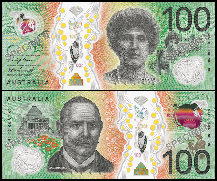
Note Printing Australia (NPA) has the most experience with polymer banknote design, printing, and security feature development. They contracted with Emery Studios for the design concept. This concept mixes a new portrait of Dame Nellie Melba, an internationally renowned soprano with music images on the front. The back shows Sir John Monash who was an engineer, military commander, and civil servant. Use of these two important Australians continues the focus on the ‘average’ citizen instead of political leaders.

Source: RBA
New Australian $100 Design
There are many interesting printed features. There is a secondary image of Dame Nellie Melba in costume as Rosina in Rossini’s Barber of Seville and a monogram from one of her concert playbills. On the reverse there is the shrine of remembrance and an image of Monash surveying an area. The colors and placement of these images along with microtext quotes from each of their lives.


Source: Banknote World
Where the design goes a bit off the rails is the overuse of the windows and overt, tilting effects. There are 2 windows and a wide clear stripe. You can find a nice owl in the windows, which I like and probably makes it very collectable. There is a semi-transparent fan in one window, a flying owl (when tilted up and down), a hologram of the denomination and Shrine (tilt side to side), a see through tilt color shift (up and down), a fan that moves when tilted side to side, an owl that moves when tilted side to side. To me, this is overkill. What is the user supposed to look at? The tilt features are in both directions on both sides, and they are not that close to each other. There is lots of bling to look at but does it rally add to the security of the banknote, or to the overall aesthetic? I am not so sure.
This might be an example where less is more.