

Security printers and Central banks face the same question we face often at the supermarket, paper or plastic. To make it sound more technical, banks will say ‘polymer’ instead of plastic, but it is the same thing. Polymer banknotes are typically a bi-oriented polypropylene. Bi-oriented means that while the polymer is still hot it is stretched in two directions to give it strength and to enable it to be uniformly thin enough for a banknote.
Increasing Use of Polymer Banknotes
More central banks have been choosing polymer banknotes recently because of their improved durability, engaging security features available and the increase in the number of sources. But what do they give up? Polymer notes certainly feel different and this takes some time for people to get used to. Co-circulating paper and polymer can be challenging in countries that do a lot of high speed sorting and use ATMs. Banks also need to consider the quality of the printing and images that can be achieved on each substrate.


Source: Reserve Bank of Australia
Manufacturing Process
Polymer banknotes start off as clear films that are opacified with multiple print layer of white ink. This forms the base for other printing inks. It is hard to achieve an equivalent opacity with ink that you get with paper. Polymer also has different viscoelastic properties than paper. Intaglio inks are pressed into paper leaving an embossing that increases the apparent ink thickness and can result in a more 3D effect. But paper also can lead to bleeding of ink so the lines printed are not as crisp. These are some of the trade offs that need to be considered.


Source: Banknote World Educational
Polymer Banknote Designs
There are several banknote designs that have remained generally the same but converted from paper to polymer. The New Zealand $5 note was paper until 1999 when it changed to polymer. The 1992 series was printed by DeLaRue on paper. The 1999 series $5 (P185a) was printed on polymer by Note Printing Australia (NPA), and then in 2015 it was printed by Canadian Banknote (CBN) on polymer (P-191). On paper, the portrait of Sir Edmund Hillary has high contrast and the dark areas (more ink) are a bit fuzzy probably due to ink bleed. The NPA portrait is nearly identical to the prior series paper version but it does appear cleaner. The CBN version is a redesign of the portrait to make it more life like and show more details. But do we expect banknote portraits to be life like?
There were attempts around 2010 to issue banknotes that had portrait images that were very life like, almost as if they were pictures. The oldest banknote portrait looks more like a banknote and is probably harder to replicate than the more lifelike versions. The CBN redesign takes the best advantage of polymer to make a more realistic representation of the subject.
Wider Varities
The New Zealand example has 2 different printers. Scotland make the change from paper to polymer banknotes but, both were printed by DeLaRue. The polymer version of the 10 Pound (P131) again has less contrast than the paper version (P125). The paper version has more depth than the polymer one. It is similar to the comparison of the paper version of the Bank of England pounds. The portrait of Queen Elizabeth II in the new 10 pound note (P395) has cleaner lines than the previous version (P389) buy is more gray and dull.


Source: Banknote World
Paper & Polymer Simultaneously
One of the most interesting comparisons is from the Gibraltar banknotes. They are all printed by DeLaRue. The 2010 – 50 Pound note (P38) is on paper. (P39) 100 Pound note is on a DLR hybrid substrate (but basically paper) and the 2011 – 100 Pound note (P40) printed on polymer. The paper 50 and 100 have line work typical of a banknote. The portrait is intentionally subtle. The polymer note has different and thicker line work to provide higher contrast to the portrait. But the line work makes the portrait definitely more typical of a banknote and less life like. It seems like a small but important evolution of portrait design. Increase line width to give higher contrast on polymer notes without trying to make the image more lifelike or crisp, because more lifelike ends up being less ‘banknote-like’.

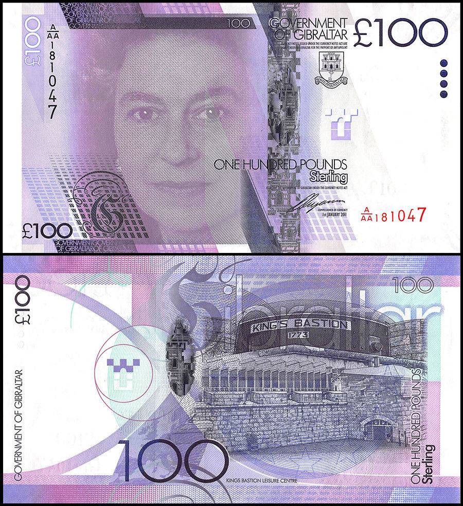
Source: Banknote World
Design and aesthetic is often a very personal decision. Banknotes though need to look obviously like banknotes. Human’s are attuned to recognize faces and to see the contrast. If banknotes lose faces and lose the contrast humans differentiate best, then they become inherently easier to counterfeit. Polymer does provide a cleaner image but as was done with the Gibraltar 100 pound note, the designer needs increase contrast and even ‘dirty up’ the note to make the portrait look like a banknote.
You can browse our wide selection of polymer banknotes by clicking here.