

How do we know the thing in our wallet is a piece of currency? And how do we judge a banknote for its beauty, design and integration of features? These are the questions banknote designers wrestle with all the time. A designer is often presented with a drawing or concept from a government official or a hired artist and asked to turn it into something that is recognizable as a banknote, printable, secure and still maintains the concept or vision provided to the designer.


Source: AS
Varying Banknote Designs
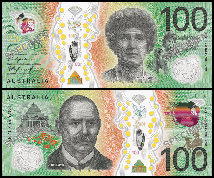
I wrote in a blog recently that I was intrigued by the new AUD 100 design but needed to see and feel it ‘in the flesh’ to complete my judgement. Well, a friend in Australia sent me one. I thought it would be good to look at its design along side the AUD 50 and AUD 10 to see how well do they ‘look like banknotes’, present the themes well, and integrate security features without being overbearing.

Source: Reserve Bank of Australia
At first glance, these three banknotes are striking. They, of course, are polymer and have windows. Three of them. Well 3 windows and a huge floor to ceiling clear area about a third of the way across the bill. Unlike many countries, Australia includes 2 portraits on most of their banknotes. The people are important to Australian history and culture but not presidents, prime ministers and monarchs that adorn most banknotes. The colors and images are clean and uncluttered allowing the few images to stand out. Each of the notes also have large, simple green and red UV fluorescent images and numbers in the same locations.


Source: Banknote World Educational
Other Distinct Features
Do these look like banknotes? Australia and many other countries have had plastic banknotes for more 30 years but, the massive top to bottom window throws off the design a bit. It is nearly 1/5th of the width and especially on the 100, it almost looks like there are 2 pieces of printed items separate from each other. For some reason, this is not as obvious in the lower denominations that are not as wide. The portraits are well engraved and are the right balance of life like and banknote-like. The small portrait of Nellie Melba in costume is amazing but detracts somewhat from the main portrait. The main portrait has great shadowing but unlike the other denominations, Ms. Melba is staring at the viewer which gives her a blank stare. All the other portraits are in profile or ¾ orientation which gives the ‘far away stare’ look to the subject. The banknotes also have some color shiny bits and colorful components we expect now on banknotes.
Do they integrate the security features in well? Double-sided intaglio and blended offset colors provide the perfect look and feel for a banknote design. UV features are simple and easy to authenticate. The metallic kinegrams in the large window are engaging, although maybe a too fine to be recognizable. The designer makes the best use of SPARK LIVE in the upper windows where the color rolls from top to the bottom of animals printed in the opacifying layer.


Source: Banknote World
Lastly, do the images accurately represent the people and the themes desired. This is where these banknotes really shine. Every image tells part of the story. The engraver pays special attention to the clothing and hair styles of each person. Even the choice of animal and holographic features supports the overall story.
Conclusion
So, what’s the verdict? These three banknotes are incredibly well designed and printed. With the slight concern about the eye location of Ms. Melba and the width of the windows notwithstanding, This banknote series is beautiful, thematically consistent and clearly modern banknotes.
Eye catching + clarity of each images
Hi yes those are the basic qualities that makes banknote designs stand out